


In addition to the metrics on each dashboard, Lumina Insights provides a set of features that let you slice and dice the data, change the time range, add context, and export results. These features are available when viewing any dashboard.
Filtering (slice and dice)
Dashboards support filters so you can focus on a subset of the data.
Dashboard-specific filters
Depending on the dashboard, you may see variables at the top of the page (for example Groups on the Group insights dashboard, or Role / Country on Community health). Use these dropdowns to filter the data to specific groups, regions, or roles. Changing a filter updates all panels that support it.
Using filters together lets you answer questions like “How did engagement change in Group X over the last quarter?” or “What is retention for users in role Y?”
Time selection
You can control the time range for the dashboard in two ways.
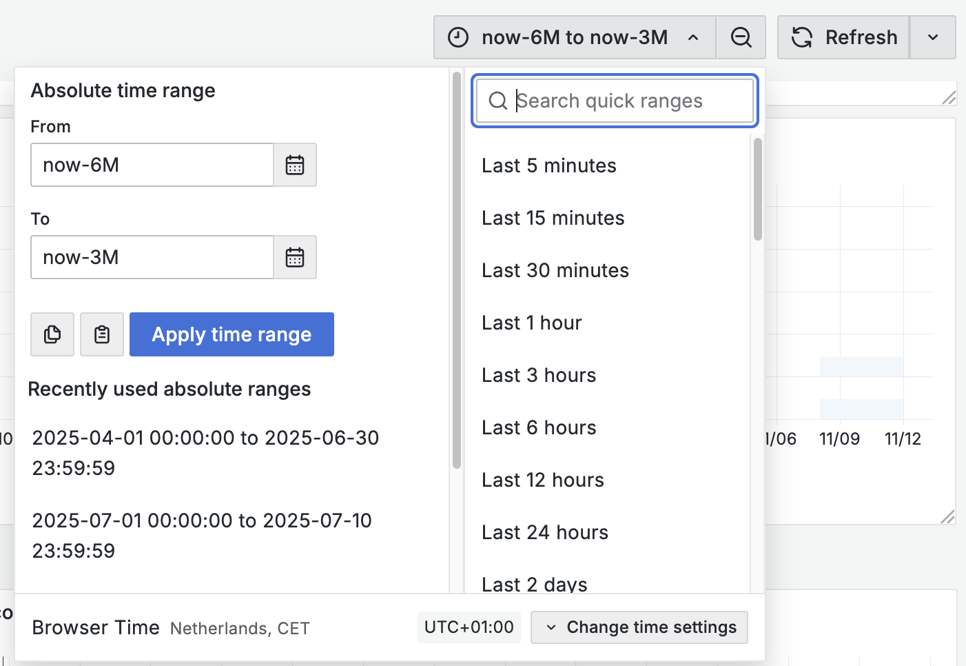
Time range dropdown
At the top of the screen, a time range control (often in the top-right) lets you choose a preset period (for example “Last 7 days”, “Last 30 days”, “Last 90 days”) or a custom range. The selected range applies to the whole dashboard, so every visualization shows data for that period.
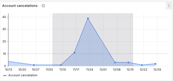
Selecting a period in a visualization
On time-series charts and similar visualizations, you can click and drag across a period on the chart to zoom in on that interval. The dashboard time range updates to match the selected period, and all panels refresh to show data for the new range. This is useful when you spot an interesting spike or dip and want to focus on that window.
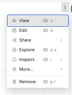
Zooming (maximizing a visualization)
To inspect a single visualization in more detail, you can maximize it (full-screen or expanded view).
- Use the panel’s menu and choose the option to maximize or expand the panel. The visualization fills the screen so you can read labels and values more easily.
- Exit the maximized view using the control that appears (for example “Back to dashboard” or the same menu).
Exporting data
You can export the data behind a visualization for use in spreadsheets or reports.
- Open the panel menu (via the icon or menu on the visualization).
- Click on Inspect and then Data. Choose the Download CSV export option. The export will include the data that is currently displayed.
- Save or open the file and use it in your preferred tool.

Exports reflect the same slice of data you see on the dashboard, so applying filters and time range before exporting gives you a dataset that matches your view.