
Purpose: Track user lifecycle, engagement, and behavior patterns across the platform.
This dashboard helps you understand how users interact with the community. Starting from signup through ongoing participation. It highlights areas where engagement is strong or declining.
For definitions of terms used below, see the Glossary.
Growth
Metrics that show how the community is growing and how many users are active or returning.
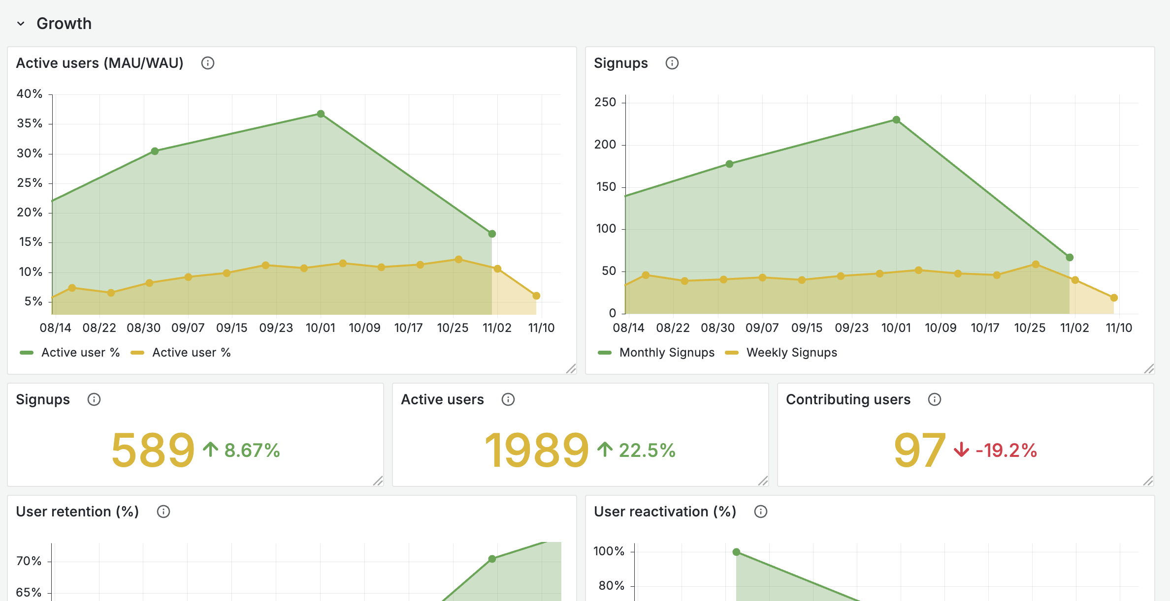
Active users (MAU/WAU)
The monthly (and weekly) active user rate as a percentage of total signed-up users (cumulative to that period) who were active in each period. This is the primary measure of overall community engagement over time.
Weekly signups
The weekly number of user signups, shown as a time series. Helps identify trends and spikes in new user acquisition.
Signups
The total number of user signups in the selected period, compared with the previous period to show growth or decline.
Active users
The number of unique users who generated any activity in the selected period. Indicates the size of the engaged community base. Compared with the previous period to highlight growth or decline in active participation.
Note: An active user is someone who generated any activity on the platform during the selected time period. This includes logins, page views, content creation, and other interactions. See Glossary.
Contributing users
The number of unique users who created content during the selected period. This distinguishes passive activity (such as logins or page views) from active contributions (such as creating posts, comments, or topics).
User retention (%)
The monthly user retention rate, measured as the percentage of users active in one month who also returned the following month. A key indicator of whether users find ongoing value in the community.
User reactivation (%)
The monthly reactivation rate: the percentage of previously inactive users (those who skipped one or more months) who return after a gap, relative to all eligible lapsed users for that month.
Adoption
Metrics that show how users adopt the platform, how evenly activity is spread, and who is driving engagement.
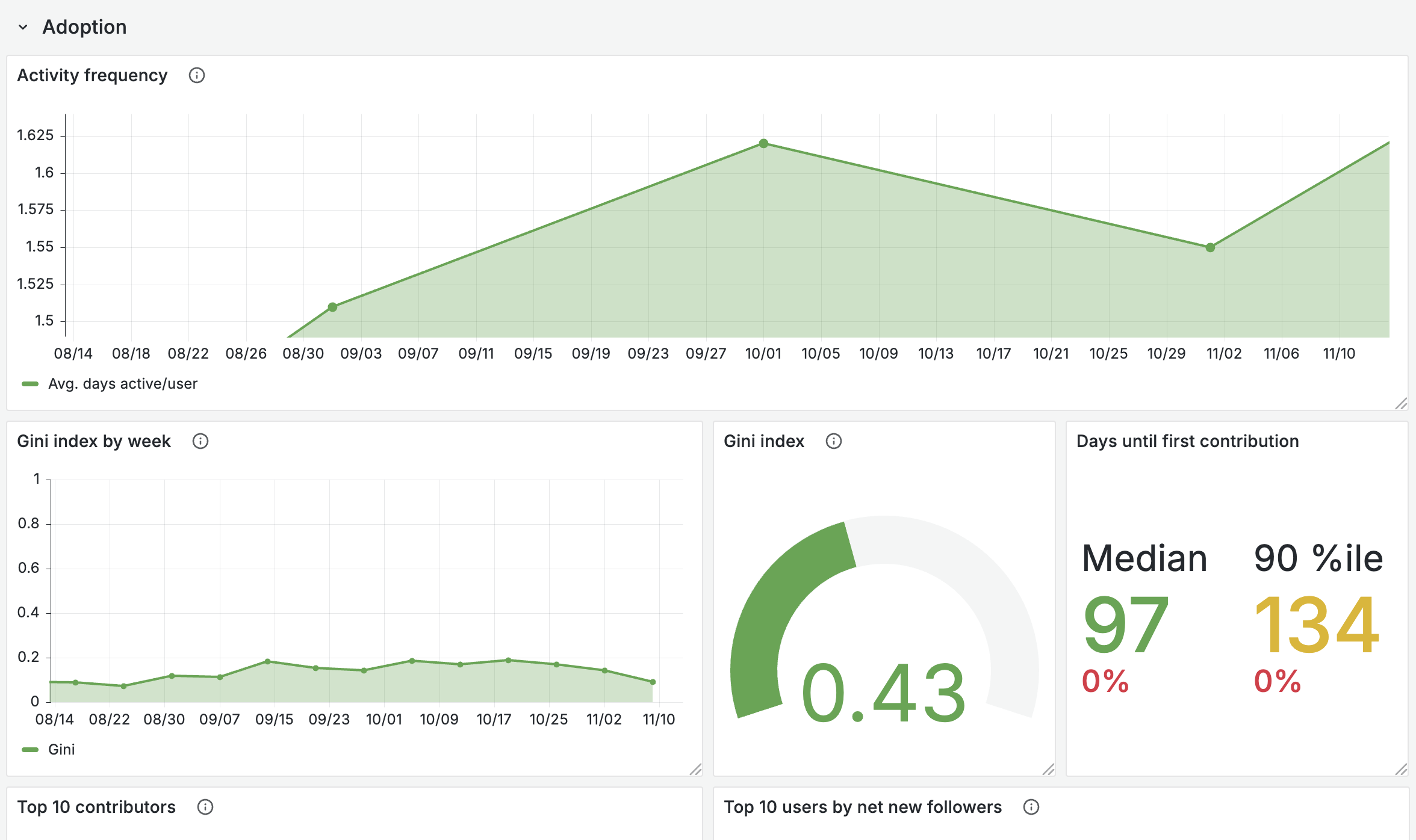
Activity frequency
The monthly activity frequency distribution among active users. Shows the average number of days users were active each month, excluding users with no activity in a given month.
Gini index by week
A week-by-week view of how evenly activity is spread across the user base. A lower Gini means broad, balanced engagement. A higher Gini means activity is concentrated in a small group of users.
Gini index
A summary measure of how evenly activity is spread across the user base. A lower Gini means broad, balanced engagement. A higher Gini means activity is concentrated in a small group of users.
Days until first contribution
Shows the median and 90th percentile number of days between a user signing up and making their first contribution. Helps evaluate onboarding effectiveness and time-to-value for new members.
Top 10 contributors
Lists the 10 most active contributors in the selected time period, ranked by the number of posts, comments, likes, or other content they created. This highlights which members are driving the majority of contributions and engagement in the community. Events like joining a group, updating a profile, or simply logging in are excluded.
Note: Use filtering (e.g. on system role) to get a deeper understanding of the contributions done by site and content managers versus regular users.
Top 10 users by net new followers
Shows the 10 users who gained the most followers (follows minus unfollows) during the selected time range. Helps identify influential members and thought leaders in the community.
Cohort activity heatmap
Shows weekly cohort-based retention: the percentage of users who were active during each week after their first login (cohort week). Limited to users whose first login falls within the selected time range. Useful for understanding how engagement evolves over the lifetime of a user cohort.
Dropoffs
Metrics that show when and how users leave or become inactive.
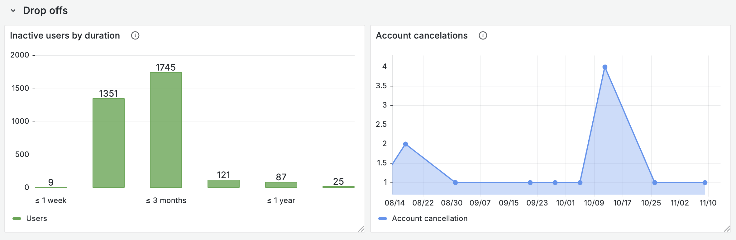
Inactive users by duration
Shows how many users are currently inactive, grouped by the length of their inactivity. Each segment indicates the number of users who have not shown any activity for the given duration. This highlights short-term versus long-term inactivity and helps identify when users are drifting away from the community.
Account cancellations
The weekly number of users cancelling their account. Helps monitor churn and identify periods of increased user loss.
Filters
Time range
All metrics respond to the selected time range.
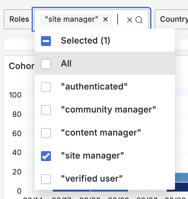
Role
Some visualizations can be filtered by the user's system role, based on their account data (if available).
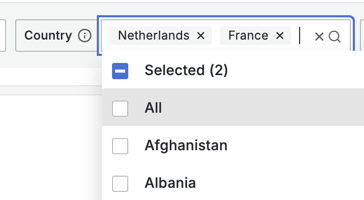
Country
Some visualizations can be filtered by the user's country, based on their profile address data (if available).